Page 1 of 1
A New Banner!
Posted: Sun Sep 10, 2017 4:02 pm
by aRt)Y
Hey guys,
as discussed
here for many months, ENT now has a new banner logo created by Av1oN for both the prosilver and dark
forum themes.
We are gonna keep the new image up for few weeks, so let us know if you like it, have other image suggestions or simply prefer the old one.
(Side note: Black theme banner is not 100% adjusted, yet.)
ENT is still looking for a coherent re-design of its public image. We would need both big (banner) and small (icons, e.g. for Discord) images/symbols. If you are an artist, give it a shot! :)
Re: A New Banner!
Posted: Sun Sep 10, 2017 6:12 pm
by efko
I made banner for default white theme and on first look it doesn't fit with black theme. You should follow the size of rounded light blue box from header and width like it is on menu bar and categories where boards/forums are on white theme. Maybe is displayed like that because header box is rounded and it automatically cuts the banner to acceptable size. Its about 15-20px smaller than forum width. Also "Search" should be moved from there since it is really on the wrong place. Rexxar is on the wrong place.
About black theme, try with this one, and also you probably have to make rounded corners:
download/file.php?id=25002I have .psd files so if there is a need to correct something, it can be done. For black theme with given banner above you probably won't need to touch search button.
About design, I think how banner for black theme can be transparent a little, maybe it should go on 70-90% visibility. Also I will try in next days to create something original for black theme.
Just to mention that black theme design is really original and professional and its hard to improve it.
Re: A New Banner!
Posted: Sun Sep 10, 2017 6:26 pm
by Dhamma
Looks good. I don't know if its my computer, but I see a blue border around the banner. Also it doesn't look centered inside the borders.
May look better without the borders.
I thought efko made this banner using av1on's text.
aRt)Y wrote:ENT is still looking for a coherent re-design of its public image. We would need both big (banner) and small (icons, e.g. for Discord) images/symbols. If you are an artist, give it a shot!

Does that mean that you're looking for another banner in addition to forum icons and such?
Edit: border gone now. Try making the banner as wide as the blue box below, so it's as wide as everything else, and add some rounded corners
Re: A New Banner!
Posted: Sun Sep 10, 2017 6:55 pm
by aRt)Y
The search box will remain as stated on the suggestion. Everything else can be improved on in time.
Re: A New Banner!
Posted: Sun Sep 10, 2017 7:29 pm
by efko
Looks good. I don't know if its my computer, but I see a blue border around the banner. Also it doesn't look centered inside the borders.
ctrl + f5
Re: A New Banner!
Posted: Mon Sep 11, 2017 8:31 am
by Jamo
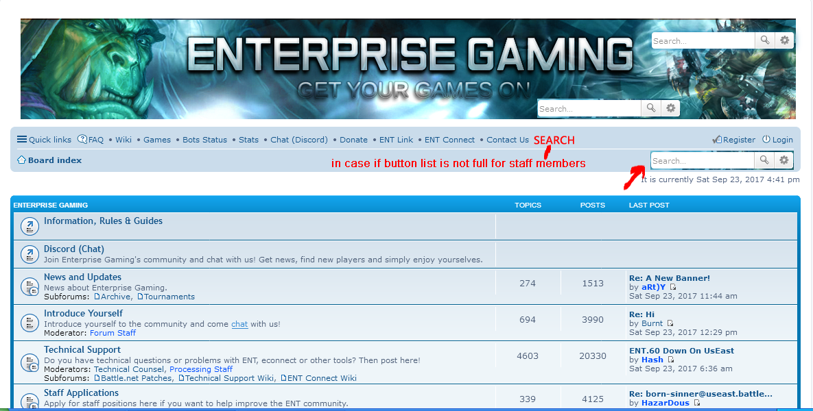
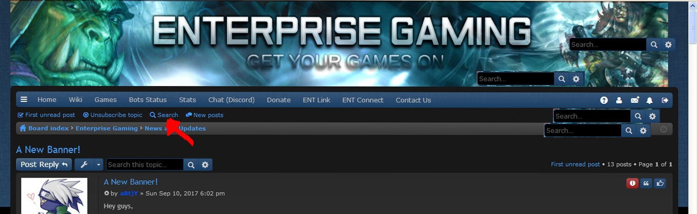
Banner looks good. But this search bar placed directly over this Orc's head completely disturbs me...
Re: A New Banner!
Posted: Mon Sep 11, 2017 9:30 pm
by bezdak
Same, the search bar is really awful and even useless, since there is another one right under it on the left side... I've never used the right one.
Re: A New Banner!
Posted: Tue Sep 12, 2017 8:54 am
by efko
aRt)Y wrote:The search box will remain as stated on the suggestion. Everything else can be improved on in time.
I'm not saying that you should remove it, but to move it somewhere else. It doesn't look good with banners. So only position should be changed. As you can see most of people here share same opinion on that. Question now is it doable moving it to another place or at least to be in the down right corner on both themes.
Re: A New Banner!
Posted: Tue Sep 12, 2017 11:39 am
by Jamo
Imo just delete it...
Re: A New Banner!
Posted: Tue Sep 12, 2017 12:11 pm
by bill7907
The banner that is currently used on the website is the one created by "Efko".
Why is there no credit given to Efko if his work has been used?
Link that shows "Efko" having initially provided the banner:
viewtopic.php?f=43&t=112850&start=45
Re: A New Banner!
Posted: Tue Sep 12, 2017 3:27 pm
by Jamo
In that thread I just saw, there is also a version without the Orc on the right side. So, if this search bar really turns out to be non-debateable (although I honestly wouldn't get why), then just use that version? I even would like it a lot without the search bar thingy. Feels kinda more tidied up.
Re: A New Banner!
Posted: Tue Sep 19, 2017 2:37 pm
by efko
7 days without new posts. What about banner adjustment for both themes? I believe how it can be bigger on white theme and with rounded corners. It should be with rounded corners on black theme as well.
Re: A New Banner!
Posted: Sat Sep 23, 2017 11:44 am
by aRt)Y
The size is mainly theme related. I will see what I can do about it though.
Regarding the search function, it is a key aspect of every forum and should remain publicly visible for everybody; not just those who know how to use a forum.
Re: A New Banner!
Posted: Sat Sep 23, 2017 5:16 pm
by efko
aRt)Y wrote:Regarding the search function, it is a key aspect of every forum and should remain publicly visible for everybody; not just those who know how to use a forum.
I completely agree with you about how search function should remain, but it should be in different form or placement should be changed - some fast made idea can be seen on attachments. So to sum things, Search button on black theme is not a problem like it is on white theme. As you can see, placement is not the same on black and on white theme, so moving it to bottom of the banner should be solution. I guess people from phpBB can give you instruction how to do that small modification.
I'm using SMF forums, here I asked for help with header, and since its similar problem, guys from phpBB should give you instructions or solutions how that can be done like people on SMF helped me -
https://www.simplemachines.org/communit ... c=555706.0
- en2.PNG (382.69 KiB) Viewed 8012 times
- en1.PNG (466.25 KiB) Viewed 8012 times
Re: A New Banner!
Posted: Thu Dec 14, 2017 11:47 am
by Jeffrys
I like it!